
Photo credit: @kravet1918
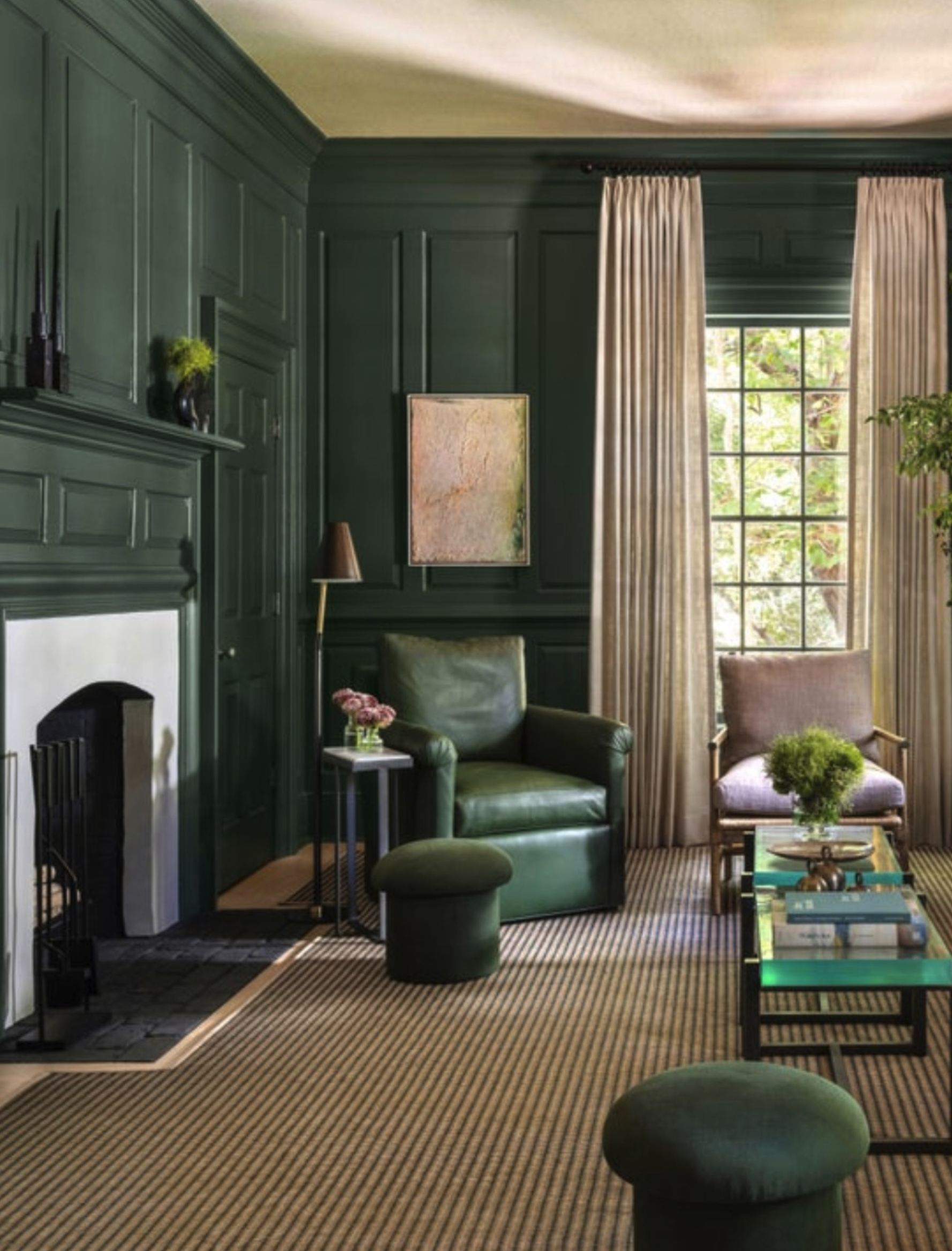
DCI Studio | Benjamin Moore | Color of the Year | Webster Green
Every October, the paint world hands us a color and the internet decides what it means. This year it is Webster Green, Benjamin Moore's Color of the Year for 2027. With decades of design experience, my first thought was not about the color. It was about where it would be going. Because a color is never just a color. It is a color in a particular room, with lighting conditions that change throughout the day, and are subject to our clients’ perceptions.
Webster Green is a deep, smoky jade pulled from Benjamin Moore's Historical Collection, which is celebrating its 50th year. It has a little age on it, in the best way. Last year's pick was a warm espresso brown, so the move to green feels like the mood shifting from cocooning to something a bit more alive.
Now picture this green in two of the locations where I work. In Greenwich or a New York apartment, the light tends to be cooler and softer, especially in rooms that face north. A deep green there can feel like a library at dusk. It wraps the room, warms up the wood and brass, and makes lamplight glow. Cooler light pulls the blue forward, so the color reads deeper and appears to be more serious. It feels right at home with paneling, books, and architecture that has some history behind it.
Palm Beach is a different conversation. The light is bright, warm, and relentless. That same green can look lighter and more playful, because the sun pulls the yellow forward. And outside every window there is already green, from palms to sea grapes to evergreen manicured lawns. So the color is not fighting the landscape, it responds to it. On a front door, in a powder room, or in a lacquered bar, it can feel fresh and a little bit daring and dramatic.
Same paint can. Two entirely different narratives!
Culture changes the story too. In an English country house, a rich green says heritage and a well-read life. In Ireland, it is identity. In many Islamic traditions, green is tied to gardens and paradise. In Japan, it can recall moss and tea. Our clients carry these associations with them, whether or not they can name them. Part of our work is to hear what a color means to them before we ever open a fan deck.
Here is how I would approach it with a client. I would start with large samples (generally I order 3-4 large paint samples), taped or painted on at least two walls/elevations to test how it reacts to changing light, and ask the clients to live with it for a few days. Look at it in the morning, in the afternoon, and at night with electric light. Green is famous for changing its mind.
Then think about sheen. A matte finish feels like velvet, while a lacquer reflects the whole room back at you. Finally, think about what it keeps company with. In New York or Connecticut, I love it with walnut, leather, aged brass, and warm light. In Palm Beach, I reach for crisp white, lighter woods, and natural and woven textures to keep it breezy.
And remember that it does not have to be paint. A green velvet chair, a lampshade, a lacquered door, or a single wall in a small room can carry it beautifully.
This also circles back to something I say often. A photo of a green room tells you almost nothing. You cannot see how it shifts through the day, or how it feels when you are curled up on the sofa with a book. You have to live with a color to know it. A “Color of the Year” is a conversation starter, not a prescription. The best rooms always begin with the same questions. Where is this home, who lives here, and how do they want to feel?
I would love to know where you land. Are you drawn to a deep green right now, or are you ready for something else entirely? Comment below and tell me.